Click to Shop!
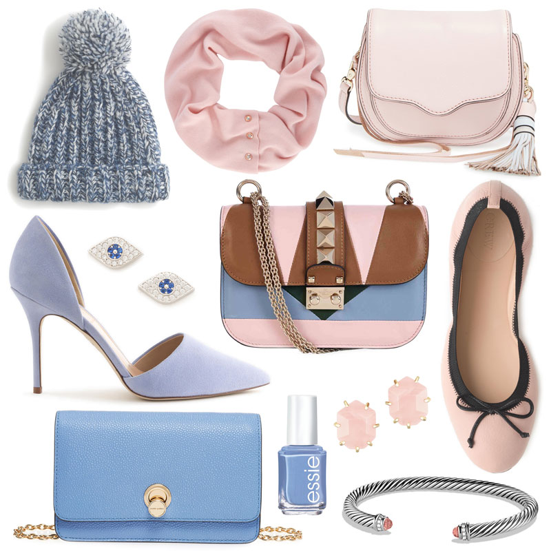
Happy Friday! Today, I was feeling some inspo from the Pantone Color(s) of the Year: Serenity and Rose Quartz! No, not panettone, the dry Italian sweet bread they always have in the gourmet foods section at Marshall’s. Pantone is the international authority on color and forecasts color trends. All the maroons and oxbloods you’ve seen this year? 2015’s color was Marsala. This is the first time there’s been two colors, that’s why it’ll be so interesting to see how designers and consumers alike adopt them. Personally, I love Rose Quartz because I view blushy pinks as neutrals. The same can’t be said for Serenity, it’s just not my fave. It reminds me of the dentist or a bad bathroom remodel in 1983. However, I saw a serenity-hued KitchenAid mixer yesterday, so maybe it’ll take off and I’ll be shocked. Pantone took a unique stance this year, stating the two colors represent social issues and changes. Some say they just want to shill more licensed lipstick at Sephora. Regardless, if you’re looking to take these tints for a test drive, do it with accessories and shoes. Less commitment, y’all (well I guess that Valentino is commitment, but we can make an exception).
Also, hop on over to my Instagram! I’m celebrating the holidays (and hitting 2,000 insta followers! what!) by giving away a pair of Kendra Scott drusy studs. Give me a follow and like this picture to enter! For extra entries, tag a friend in the comments on Instagram and/or subscribe for 10th and James updates (look at the column on the right!). Contest closes Monday at midnight, winner announced Tuesday! Good luck!
Emily